Oh Radiant Orchid…
You are such a pretty color with all your pink and purple hues
Bold and beautiful- Radiant Orchid is an eye catching color
Whether it’s love you feel with this color
or you aren’t really sure
or definitely not so much
Pantone Radiant Orchid
is the color of the year for 2014.
or you aren’t really sure
or definitely not so much
Pantone Radiant Orchid
is the color of the year for 2014.
I love soft lavender and purple touches in accessories but
I don’t have too many incorporated into a room or design
and bright colors? Not so much.
and bright colors? Not so much.
So when the Lowes Creative Ideas challenge for March was to use
Radiant Orchid in a decor project I will admit…
it took me a little while to come up with a project I felt was a perfect way
that I could use this bolder than my usual style color
it took me a little while to come up with a project I felt was a perfect way
that I could use this bolder than my usual style color
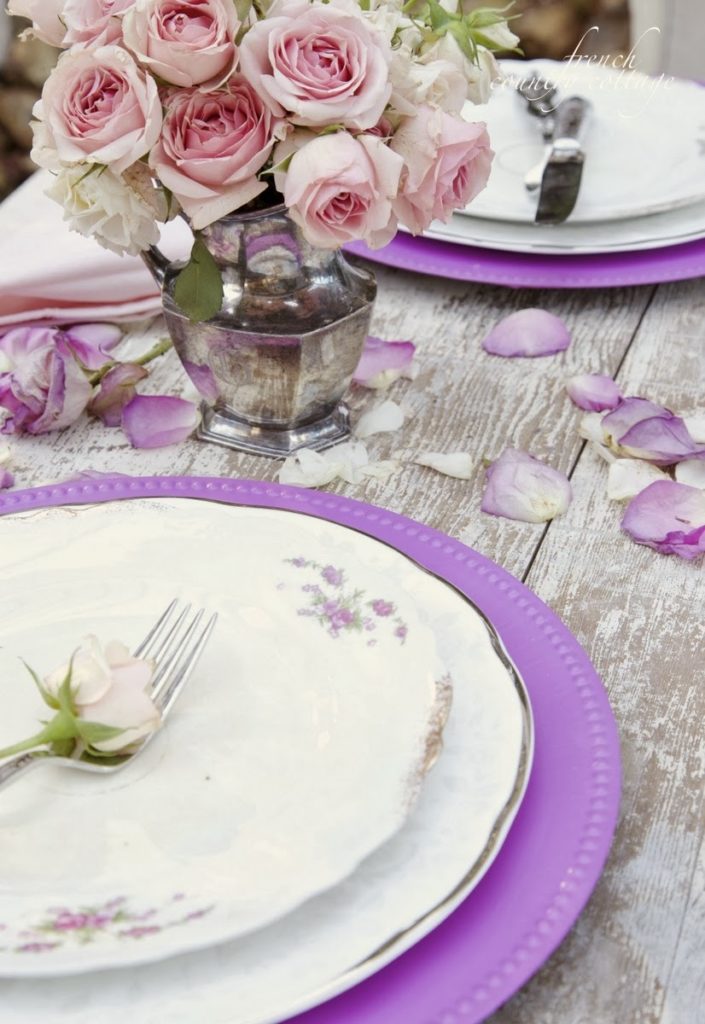
So I thought about some of the ways that I love to use purples and pinks
which made me think of flowers
and table settings
and that led me to think of
chargers.
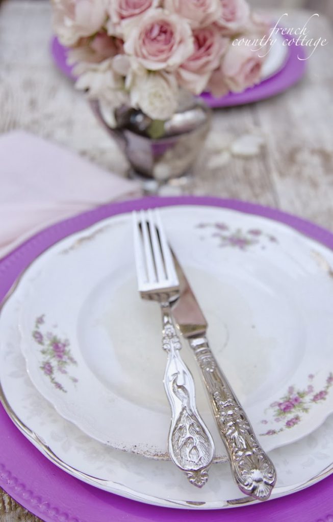
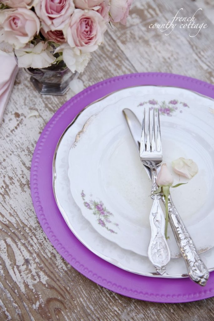
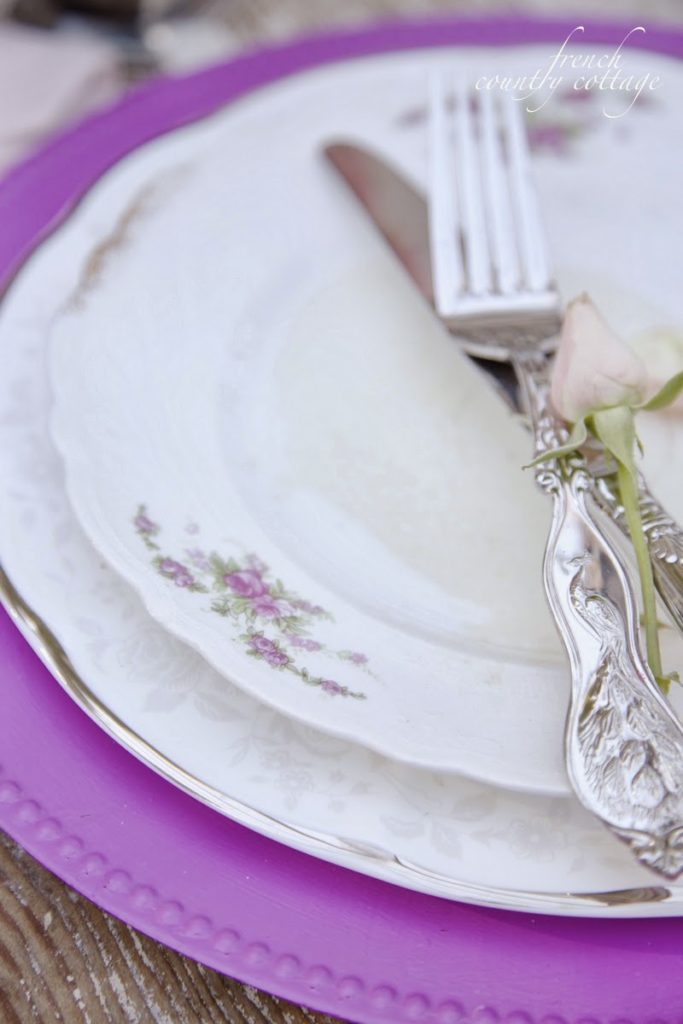
I thought maybe a pop of Radiant Orchid on a charger
paired with vintage white china
just might be perfect
paired with vintage white china
just might be perfect
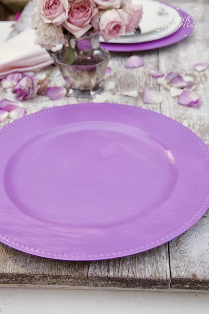
So I picked up a can of Radiant Orchid in the paint department at Lowes
and got to work.
These chargers are plastic – the ones that you can find all.the.time at the thrift store
or the dollar store even. Perfect candidates for a makeover being that they are inexpensive
or the dollar store even. Perfect candidates for a makeover being that they are inexpensive
I thought they would be pretty in purple for a Spring inspired table
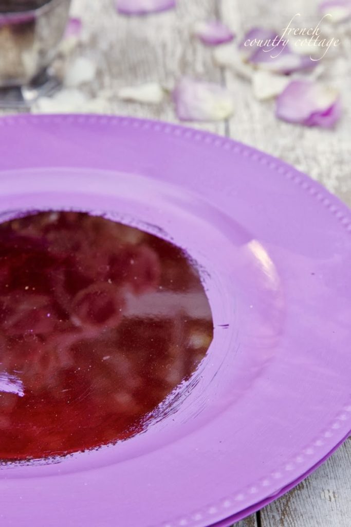
Since they were shiny plastic- they were scratched a bit with sandpaper
and then simply covered in a couple coats of paint
I love how the color was a near perfect match for the colors of the flowers
on the vintage china.
Even though it is not my usual style- I am loving how they turned out.
They are perfect for a spring table setting and are a simple way to incorporate
that bold and beautiful Radiant Orchid
What about you?
Are you loving Radiant Orchid
or not so much?
You can find more ideas searching the hashtag #springiscalling

I am thrilled to be a member of the Lowes Creative Ideas Network
and was compensated for this post but all designs and opinions are my own, of course.
You can find more projects and ideas at the Lowes Creative Ideas Blog
and on the Lowes Creative Ideas App in the App Store.
sharing at
Enter your email address:
Delivered by FeedBurner
Beautiful color and gorgeous table setting. I think I may try this for a spring table.
Beautiful on your table with the vintage plates, Courtney! The shade is a little on the bright side for me, but I can certainly see it watered down a bit with some white and brown to create a duskier shade of orchid. 🙂
xoxo laurie
Yes, it is a little bold as is for us shabby loving girls- it would be pretty with some softening to it as well.
Surprisingly, I am really liking purples lately, myself and even started a board on Pinterest.. Beautiful table setting:-)
xoxo
Kathleen
I always thought lavender was pretty when showcased in the perfect way…like your table-scape. Gorg!
Love what you did with this lovely new color. Thanks for the tip to paint plastic chargers.
Love what you did with this lovely new color. Thanks for the tip to paint plastic chargers.
Thank you~ so many possibilities!!
Okay Courtney–you got me!
I'll stop passing up those chargers!
Catherine
I know and they are so inexpensive and easy to change!
Think the chargers turned out beautiful. They complement the vintage plate perfectly. Anything you do is always stunning. I love the idea of painting the chargers. I am definitely using this idea.
Janet
I'm not a fan of Pantone's color of the year radiant orchid. Your photography makes the color look more like purple rather than a mauve shade (which I'm not fond of) I have to say that your project looks great, especially for spring. It looks marvelous paired with your delicate vintage dishes and silver. Well done!
Thank you!! This color definitely looks different in different lights- and I think the red of the charger behind it might play a part also.
It's I it's a tricky color but you've made it work perfectly!
Our French themed bedroom has touches of this color in toile and check. I love it!
The color is abit bright for me, but I appreciate different colors and how they can work within a different palette. I love what you did with it! It looks beautiful!
I love it in these plates! Eclecticallydesigned.com
I painted a silver tray from the thrift store this great new color. Added vintage white touches and painted the center with chalkboard paint. It is listed in my Etsy shop. Great pop of color for spring!
Turned out amazing!