Today, I am sharing more about the method to my madness and how to decorate with neutral colors.
Neutral colors can tend to have a bad rap. They are too soft and simple. Basic. Not bold and beautiful. And they have even been known to have been called ‘Bland and boring. But I don’t see them like that- I see just the opposite. To me- neutral colors say ‘Layers of Lovely’ and so much more.
If you were to look in my linen closet- you would notice 2 things.
- I have a BIG love of those ‘shades’ of white, linen, and soft pastels.
- I have a BIG love of those neutral shades and should probably do a bit of a sort -and share some with the thrift store. haha.
What is it about neutrals that I love? There are a lot of things- but I guess to sum them up- they are colors that speak quietly and yet- they have a delicious impact in a room. I kind of equate them to batting your eyelashes. Beauty, layers, elegance and charm- and speaking so softly like a butterfly – it is like an eyelash ‘whisper’.
They play a complimentary role rather than center stage. They accent and support the main pieces in the room- and also add the perfect finishing touch.
But… soft colors are boring
Author
That is debatable I suppose. It really depends on what speaks to you- and what speaks to me. And what speaks to each person before you can put a blanket statement on something. I completely understand if you think they are boring and even if after reading this post- you feel the same way. No worries- while your sofa may look more bold and different- soft & natural is what works for me in my home. We can still be friends. I think Everyone should go with what makes them happy. That is perfection.
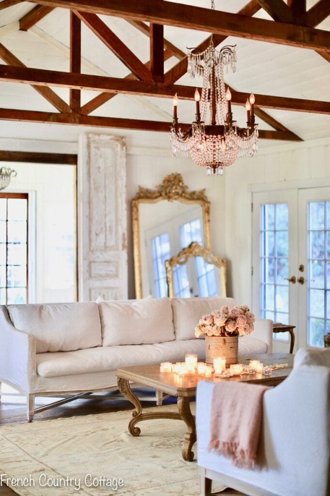
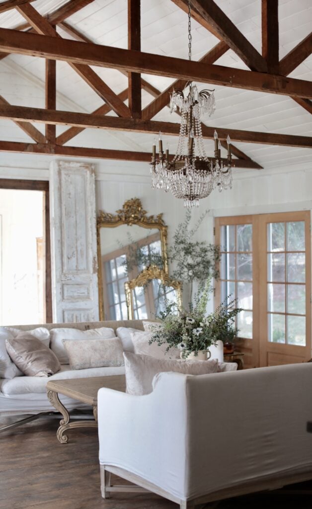
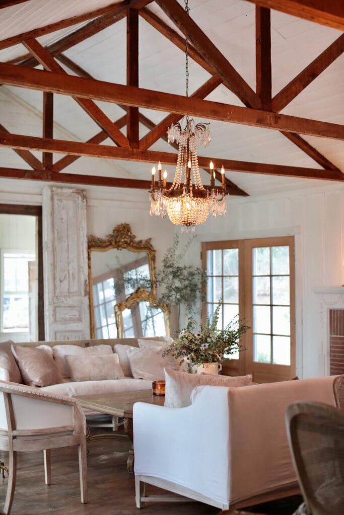
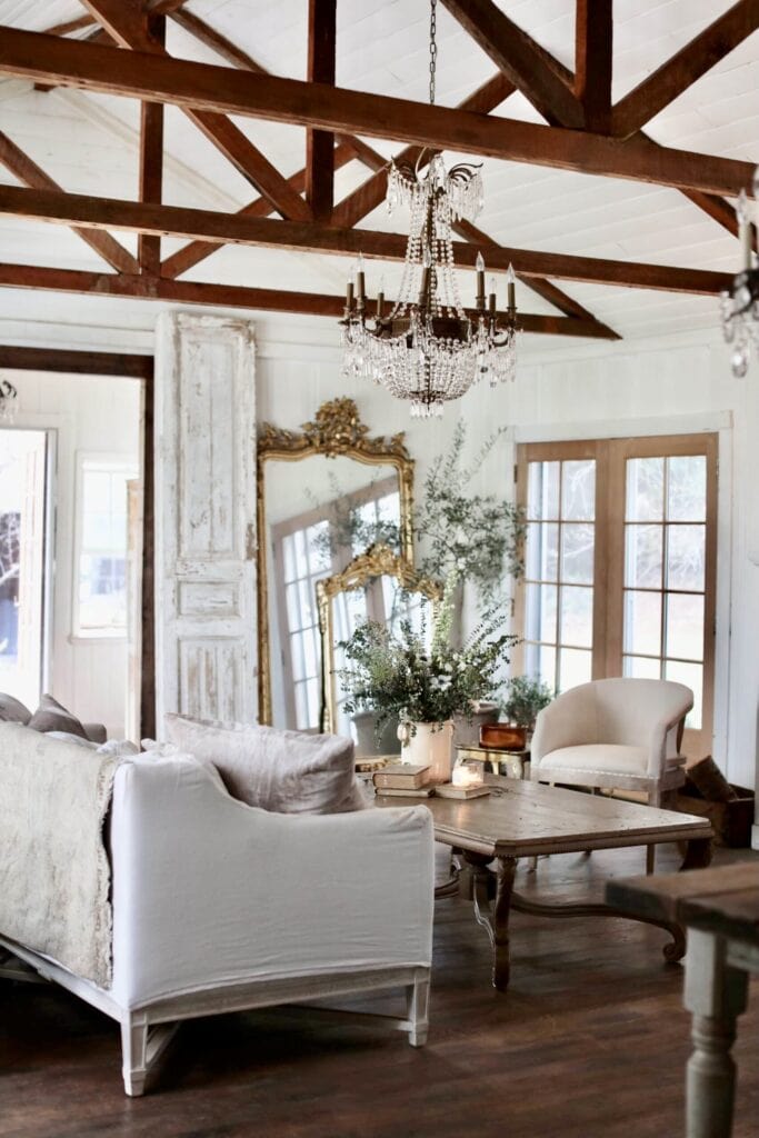
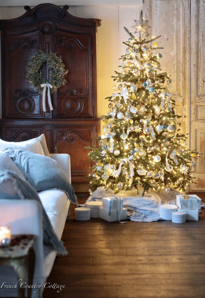
For me- I start with a neutral base. In our living room- that is our white linen sofas & white walls. It is easy to completely change the look of a room when you start there- bring in jewel tones for the holidays or a piece of furniture wearing a bold color and jazz the room up. And on the contrary- it is also easy to decorate in a more serene and quiet kind of way with just a neutral palette. Out in the cottage- I walk on the wild side and indulge those saturated colors more. The black bookcases with colorful books for example. And my love of tufted sofas and chairs that always seem to want to be vintage color rather than a neutral. Each space, home and person are different- so go with what talks to you.
But if you are going to go with neutrals- just How do you keep neutrals from feeling ‘cold’ and ‘boring’ ?
What to look for when decorating with neutrals
Everyone knows those all white, very cold and chilly feeling spaces that are more modern and seem to be popular. The ones that make you feel like you can’t sit down – let alone want to sit down and stay awhile. That is not the goal here. I am allllll about warmth and a welcoming feeling in a room. My go to formula looks more like natural linen and chunky knits than crisp and ‘sterile’ and clean. And there are three things I look for when decorating with neutrals that I feel are Key to creating that feeling:
- Texture
- Shade
- Layers
1. Texture
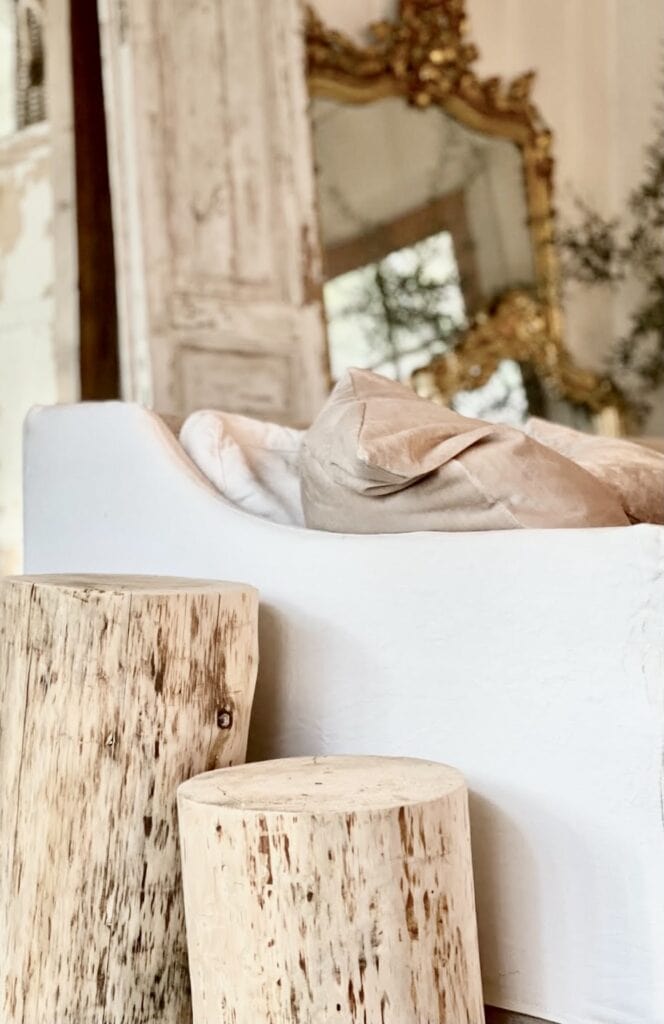
Delicious nubby bits like linen, grasscloth, woven fabrics, velvet, etc. Those textures can take those soft colors and tones and send them into a new realm of deliciousness. In our living room, I recently added the most beautiful velvet pillows- I am quite literally obsessed with them. They are soft with that delicate velvet texture, they are squishy like old well loved pillows that have been enjoyed for years and they have the most amazing shade that is perfect for my style.
2. Shade
On that same note- I have searched high and low for the perfect shade for the throw pillows.
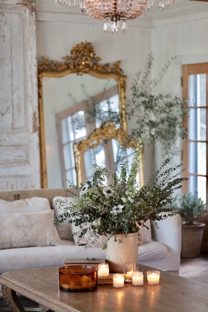
I ordered a random velvet lumbar pillow from Marshalls for a chair- and it was INCREDIBLE. THE perfect color of champagne velvet- that leaned ever so slightly blush. Of course, they only had lumbar pillows. And the quest went on…until I saw these big champagne velvet pillows from the same maker show up as available one day. I ordered 8 and am completely in love. So the key here- it was the shade is what spoke to me. These pillows have a two-fold appeal- they have the texture (velvet) and the shade that make them perfect.
3. Layers
Layers & texture are like personality in a room.
Bring in allllll those layers. Something to remember when decorating with neutrals is that layers are like adding personality. One layer is quiet, the next makes a bit more noisy with a subtle pattern, and the third is just adding a touch of cozy. Or something like that. Basically- bring in ALL those layers when you are keeping the supporting roles neutral. I like to have at least 2 different styles, sizes or types of pillows. Maybe a simple plain linen. Maybe a floral tossed in for a touch of whimsy. You get the idea. The key is just to not have 6 or 10 or 12 or whatever pillows that are all exactly the same. Add some personality with the layers.
Something else you might have noticed- I have a ‘layer of texture’ on the back of the sofa. This is actually a vintage Turkish rug. I know- so random. But I don’t use all the rugs on the floor all the time (hardly ever actually) and this was one I loved the pattern and colors and small runner size on- but had nowhere to put it. I have learned to grab something when it talks to me- so I did knowing I would find the perfect spot. And the sofa was it. BTW: All cleaned and sanitized BEFORE bringing in the house- so no worries there.
I love the interest it adds- and that even though it has so much interest and texture- it is incredibly quiet in color and tone. So it is a a layer with personality- but not one that makes you feel overwhelmed. Bonus? If you have furry friends that like to climb on the back of the sofa- it is great protection.
But…what about the ‘pop’ in a room. How do you mix in some color in a room filled with neutrals?
Well sure. There should be something in the room that adds that pop of pretty and makes a statement. I think you might already have a great idea of what some of my favorite things to use for a pop of personality and color are.
4. Flowers
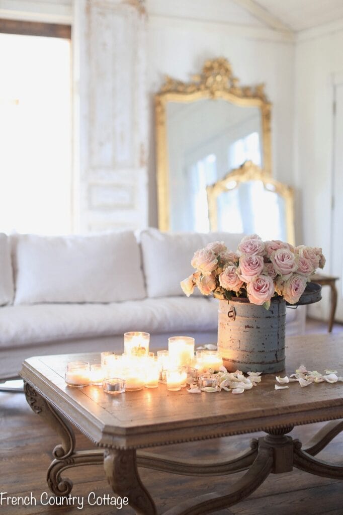
Flowers are a perfect way to bring in a bit of a pop of color. Go with what you love- bold saturated hues like rich reds or a burst of sunshine with yellows or oranges. Or you can use another layer of a softer color like blush or faded green if that is what you prefer. Best part here- you can change that pop of color as you change the flowers. Bring in bold color one week- soft the next, all greenery, etc.
5. Go for the Bold
And another way to bring in a pop is to use an unexpected bold or darker color or finish in your room full of neutrals. The gold on the mirrors brings a gleaming bit of interest and also creates beautiful layers behind the sofa. The other elements in here that are more rich in color – the dark wood buffet deux corps that brings a warm feeling to the room. So the key is you don’t have to have ONLY neutrals in your room to decorate with neutrals- those unexpected pieces bring more personality and interest without taking over the look.
Don’t be afraid to decorate with neutrals and soft colors if you love them. Bring in the texture and details and when you find the perfect shade of whatever color pillows you are looking for- buy them. And if you want to add a tad of sass with a touch of bold too? Go For It. Want to bring in that pop of color without big commitment? Use those bold and beautiful flowers and enjoy the change they bring. No matter how you decide to decorate your home with a neutral palette- the most important thing to remember- is if it makes YOU happy- it is PERFECT.
The thing I love about Friday Favorites is that it is all about finding past posts that I love and that you love and updating them. Since we are always learning and changing things- it is a great way to incorporate more ideas. I hope you enjoy them too. Happy Friday favorites all.
I absolutely LOVED this, and could not agree with you more COURTnEY! 😀 I was able to snatch two champaign velvet pillows from TJMax recently and I LOVE them as well as the quality brand. I have been patiently searching for a lumbar pillow to coordinate and mix it up a bit. I LOVE yours- I’ll have to check out Marshalls ONLINE, thanks for the tip. I wondered what was on the back of your sofa a couple blogs ago….nice touch! 😉
So glad you could find a couple of them- they are such beautiful pillows! I have found some amazing things at TjMaxx and Marshalls online- both are definitely worth checking frequently- and often will have more of what you find in stores. The rug is so random haha! But I do love it there.
A bloody good post
Thanks Jo!
Love neutrals but ive also always been drawn to muted green. Fought it Since the 90’s (after having the dark gReen kitchen and faMily rm in the 80’s which Was THE color!). I have now given myself permission to love green again and am adding touches of green to my home. But i do love neutrals, they calM me down and i feel peaceful. Lots of stuff and colour Puts me on edge (Actually a mediCal problem. SpeNt Most of the day in eMergencY and had every type of test to figure out what was wrong. Turns out it was an over stimulation of colour, pattern and scent after spending the daY clothes and shoe shopping. I was actually passing out severaL times at the table talking to my husband. Now when i shop and recOgnize the signs of Feeling closed in I leave before it sets in. Yup, i older i get the more fun i am, lol.
Oh gosh!! I hope that everything is okay and you can find what works and keeps you in a good space. Overstimulation of colors, energy, scents, etc can definitely be a lot and sounds like it might be creating claustrophobia for you.
I completely hear you on the green. I can’t tell you how many times I have thought about a tufted sofa in a bold color like green velvet and how delicious it would look. I personally could Go bold and enjoy it in a single piece- for example- I have a dark blue/gray velvet quilt on the bed right now and I absolutely love it. But I also love the quiet look so keep color mostly to things that can easily be swapped out with my changing moods.I definitely do believe patterns and bold colors have a place in design and are stunning and if you love green- GO FOR IT!!! It will make you happy every time you see it and that is most important!
My livingroom is neutrals. Never thought of velvet .too fussy .ive rethought that …..beautiful.
Love your beautiful home!
I am a color person…how3ver, that being said, that “champagne blush pink is SO beautiful!! My daughter…totally opposite 🙂 franki
I love your home, your site, bEcause ilove EVERYTHING you do. WIth that being said, be it green, red, purple, orange, or whatever COLOR YOU chOose, it will be fabulous, because you trulY know how to pull things together, and make it work.
I truly agree with you – neutrals for me too – though in the master bdrm i have been experimenting with some neat color for the first time in forever. but for the remainder of the house and in my soul? always neutrals.
i let black be my pops lol and i sway towards greens before pinks, and never too ornate – as far as style. but i find myself always daydreaming of having something of your world. a girl can dream, right? : = D
thank you for your love of all things beautiful and sharing it with us, courtney.
I am in love with your coffee table! Could you tell me who the manufacturer is and where it was purchased. I have been on a mission to find it on the internet with absolutely no luck! I LOVE THE ROOM. IT IS PERFECT.
THANK YOU.
Hi there,
It is from French Heritage- I found it in their showroom in Las Vegas Market.
Thank you so much Courtney. I will definitely look into purchasing it. Your style is impeccable and a true inspiration to us. Love, love, love all the neutrals. Such a beautiful look!!!
I love your style and your neutral colors in your house but I’m a color person and love sage green, dark red, and golden yellow (not bright, not light), and a little blue. we are in a brand new house for the past 2.5 years. so guess what color is in the whole house including the 2nd floor? grey! I can appreciate it in other homes, but I need to have color. i would have preferred all white walls instead of grey. even though white can be cold. I feel like I’m living in a cloudy day indoors. 🙁 It’s okay and it can be pretty, but I’m very very slowly working on painting the walls like i had in my previous house which was an American foursquare. in that house, we repainted everything else. got rid of the beige. we had a sage green living room, medium yellow dining room,and did the bedrooms over too. so i have my new house kitchen partially painted in the same dark red. we have white cabinets anyway, which is great. because of my physical ailments i can’t do too much at a time, so the painting projects are taking forever. but i finally finished the half-bath with a blue hydrangea wallpaper! It’s a york wallpaper. it looks awesome and elegant. I still have to wallpaper the adjoining laundry room – only one wall of it – with the same paper and change out the ceiling light with a little chandelier! 🙂 the rest of the walls in the laundry room will stay grey, but that’s okay. 🙂
Just beautiful! Thanks for yOur INSPIRATION!
Hi Courtney,
This is lovely and the soft blush is perfect. I’ve had that very same problem…finding a perfect thing, buying one of that thing, and then rushing back only to discover there isn’t anthing left.
xo,
Karen
I love your pointers and I love your pictures! You have a special gift with decorating in this style. This is just how I’d love my own home. Thank you for always making my day a little more special!
Love french love linen!
Where did you source your sofa its gorgegous
I have been looking for the coffee table in your living room, i rememBer whrn you bought it, but cannot remember from what company. Please Provide me with the company’s name.
Thanks.
Hi Beverly, it is from French Heritage.
I also lovE neutrals thanks for another great post
Hi Courtney,
your ability to create a warm and in iting room without clutter is top notch. I admire the way you blend all the layers, tExtures, colors and patinas into a beautiful cohesive space. It is so inviting. In a few years My husband and I will be retiring to an open concept home in a neighboring state. In thinking about which furniture and decor items to take and how to add our own spin on the home I have many questions about how to create a timeless look that we wont want to “update” when we are in our “senior” years. I know your idea of NEUTRALS layered with texture makes sense. How does one go about deciding on finishes for fixtures, appliances, Cabinet and door colors, MILLWORK, etc So it will be an appealing look for many years? Thank you for your input and effort in advance.
Happy Saturday,
Kim
Great question Kim. I will see what I can do and talk more about this in a post soon!