How do you feel about Pantone’s color of the year~ Emerald Green?
Have you embraced it and added it to your color palette in your home?
Was it what you were expecting Emerald Green to look like?
Was it what you were expecting Emerald Green to look like?

As a Lowes Creative Ideas blogger ~ one of our Lowes projects that
we were given recently was a challenge to use
the Pantone Emerald Green Color of the year somehow in our homes or projects.
I thought maybe a dark green emerald front door would be pretty and that was my plan
but when I picked up the specific paint color formula that we were given
it was just a wee bit brighter than I was expecting.
Soo… I thought about it.
Brushed a bit of it on a few things and then had an idea about how I could incorporate
Pantone’s Emerald into my shabby vintage style.
Brushed a bit of it on a few things and then had an idea about how I could incorporate
Pantone’s Emerald into my shabby vintage style.
I did a couple different projects actually and both involved creating a vintage inspired patina.
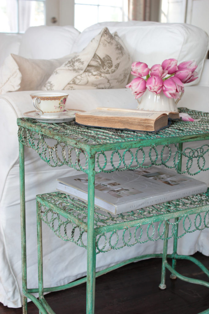
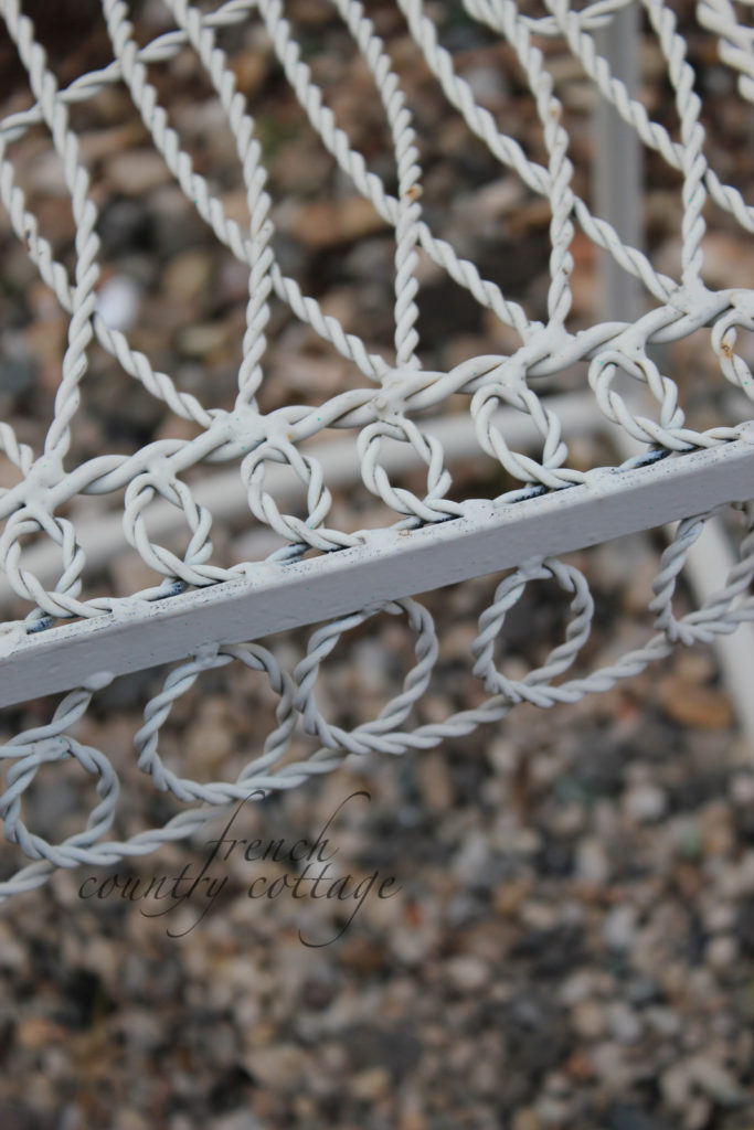
The first was this little outdoor wire table.
It started out a cream color
and I brushed a bit of the green over it
and then wiped an antiquing stain on top of that
and rubbed it so that some came off and some stayed on.
Vintage inspired and would be really cute for out in the garden.
(this project was done in February so it was photographed indoors)
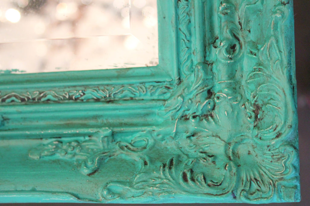
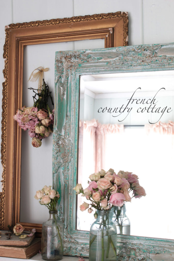
I also had a really neat detailed mirror frame that was waiting for a makeover
That also started out a creamy white but
it didn’t take much to give it a new look with a little green paint
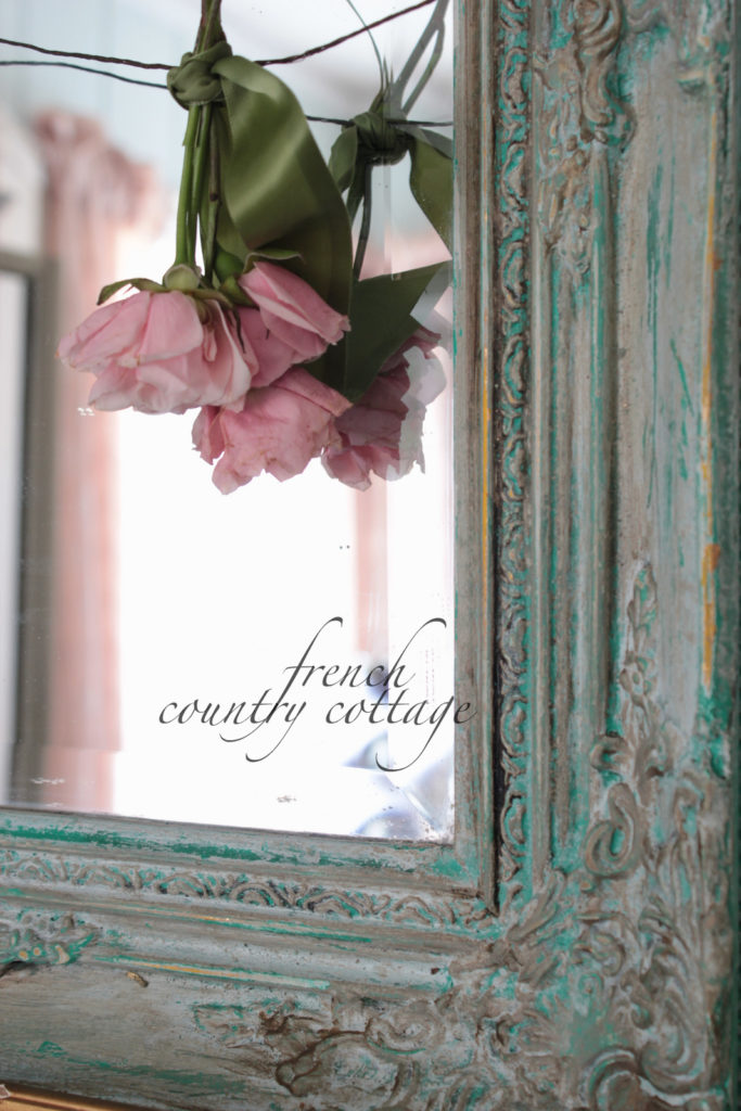
You can see the original brighter green blue on the edges and the center areas which took the stain more
and darkened the color.
Honestly, though it was pretty, it was also pretty bright for my decor
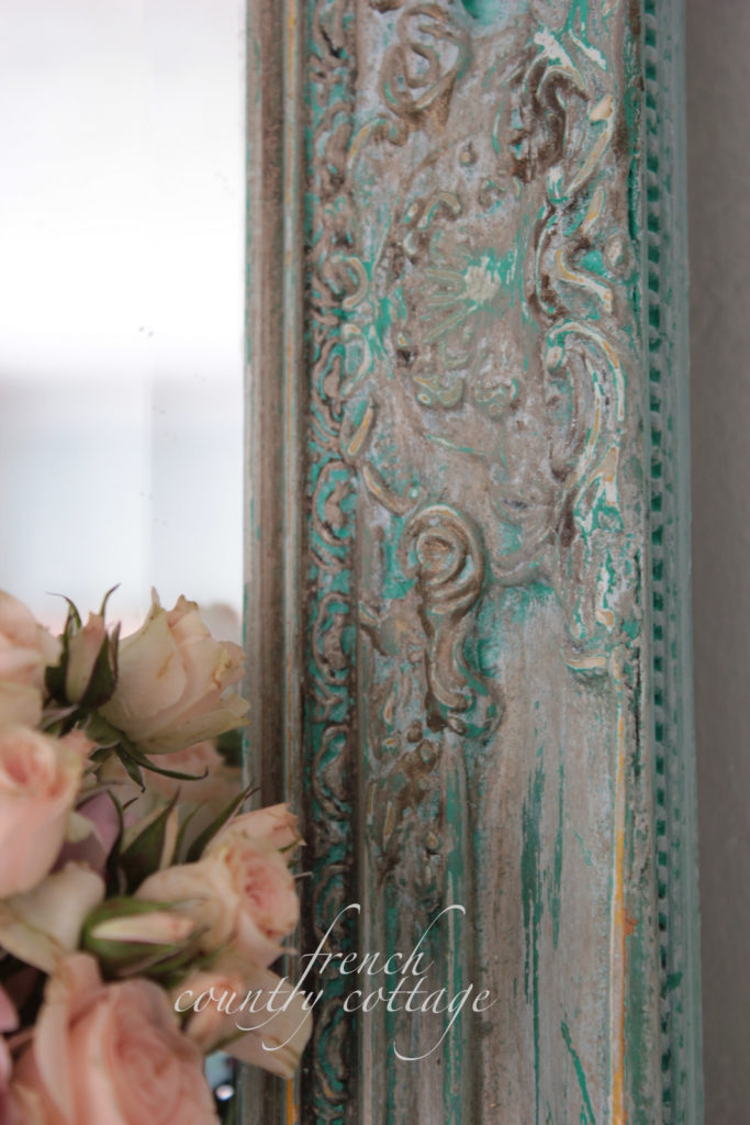
even after wiping the antiquing stain on it. So I decided to use the green as a layer.
A coat of gold craft store paint over the green and then a coat of a vanilla dry brushed on top was first.
Then another layer of antiquing stain that darkened the color and settled into the details
Then it took just a little sanding to remove some of those layers of paint
that I just added and reveal the layers
I love the little bit of the glistening of the gold paint shining through
and the bright green that shows through.
I also love how some of it settled into the deeper details so you can see that ‘pop’ of color
Pantone’s Emerald Green formula is available exclusively at Lowes
if you would like to try it for yourself!
You can find more inspiration over at the Lowes Creative Ideas blog
and by signing up for the Lowes Creative Ideas Magazine~ it’s FREE and filled with
tons of great ideas.
They even have an app for it in the app store now too
where you will find some of the Creative Ideas Bloggers projects featured from time to time.
I am thrilled to be a member of the Lowes Creative Ideas Creators and Influencers Network
and am provided with gift cards for my projects & for my work.
All ideas, opinions and designs are my own of course!
sharing at
wow
wow



Your projects both turned out great, toning down the loudness of the original hue. Nice work!
Rita C.
I so love that beautiful color-I think it looks lighter, brighter than what I mean when I say emerald green but I love it just the same.
Have a wonderful weekend.
that looks real good, I haven't even thought about changing the paint color in my kitchen, however I could paint one of my dish cabinets that color toned down a little
love the wicker painted that color
Have a warn weekend , it is 35 here and up the road toward Kansas City Mo, they have snow
I wanted nothing to do with Pantone's new color… I thought it was an unusual pick. But you have changed my mind. I LOVE the little side table. But it is the undertones of emerald green on the frame that I find entirely striking!!! Beautiful job Courtney!
I really like what you done Courtney but you could make a chicken coop look good. lol! Have a great weekend.
I think it is just to much. I love green but I would'nt use this one in my house.
Good luck with painting something!
greeting Judith from so cozy vintage (Holland)
I have not tried the Emerald as I though it was a bit bright for me, and my decor. BUT… yes, but 🙂 I luv the way you have used it. Now I am game to try it. The green toned down w/ the gold and dry brushed white… yes!!
Thanks for the inspiration Courtney.
Hugs, Gee
I love the mirror frame, especially with the bits of gold showing through – really gorgeous!.
Very pretty! I love the green toned down a bit. Great idea.
Your projects turned out very well and I like how you sanded and layered the finish to make it more 'Courtney'. Although it appears to be a bright green, I personally prefer that to the 80's emerald green.
Courtney, your projects turned out beautiful! I love the frame.
This looks fantastic. I love the pop of brightness underneath! I need to try this! Thanks for the inspiration! x
At first glance, I thought the color seemed rather bold. I love how it looks on that little table though…so vintage and charming. xo
I would have passed that color right by. Way to bright for me. But I love how you used it on the mirror! Stunning!
This color is gorgeous! It is very French and aged looking. Thanks for the inspiration. Susan @ throughmyporchwindow.blogspot.com
Beautiful color Courtney! Love your beautiful table and just the right pop of color for your pretty mirror too!
xx
Anne
I LOVE what you've done with that green paint! Honestly if I saw that color I'd run… but I love the way you toned it down and made it fit in with your decor! Brilliant!
You did a fantastic job with that paint color. I love the little table and frame is gorgeous.
Beautiful job Courtney. When you live in a white world like so many of us shabby lovin girls do. Then think about introducing a color like Emerald green – you think no way! too much- but you pulled it off beautifully xo Elle sweetpeaschicnshabbies.blogspot.com
I really love the mirror frame it turned out lovely. I think the gold coming through the green really works.
Both turned out beautifully but I really love the mirror–wonderful layers of color to bring out the texture. Thank you for the inspiration!
Green with Envy! Wicked Awesome Job! Charlene with http://www.whitebarnheirlooms.com
Ooooo la la! It looks so French, Courtney! I love it! That sweet pop of color is just perfection! 🙂
xoxo laurie
STUNNING!!!!!!!
Your tables and the mirror's frame look terrific, Courtney! I like the way you toned everything down and left just the hints of green on the mirror. Both are lovely.
amazing! Especially the picture frame.
As so many have said, I would have passed that color right by, but how you used it makes me take a second look.
Judith
I like how both of your projects turned out, lots of age in less time …suek
Not at all the Emerald green I grew up with! Reminds me of an Annie Sloan chalk paint color. Beautiful use of the color on your projects Courtney!
Wow..I love the projects and the frame is just so amazing with the beautiful layers…what a great idea to use the green as one of the gorgeous layers on the mirror.
Love what you did with that colour… seriously gorgeous… xv
Such a gorgeous color! The antiquing stain really tones it down and makes it even prettier!
I always look to Lowes for their paints. I have seen these paints but have been afraid to try. Now I will! And I have a small frame to try it on.
I like the gold & white to give it that aged look. I think I will play with adding pint too!
Keep'em coming. I love the ideas!
Barbara Ann
I have a cupboard this color in my bedroom…. now I think I will do a mirror to match using Lowe's paint! Thank you so much for the idea! Looks wonderful!
PRECIOSO EL COLOR DE LA MESA…
TODO EL BLOG MUY BUENO.
SALUDITOS
Perfectly done. The scallops on the side tables are so adorable.
Tres chic, Courtney! You did it again!
Gorgeous color. I love what you've done with it, Courtney. I would use this! I'm not afraid of a bright color here and there. . .so much of our home is "masculine", or what one might perceive to be masculine, as Carl has lived here longer than I. Changes are s-l-o-w (LOL) to happen, but I have won over the dining area, so far! I've been hoping to get a little color elsewhere. . .this would be very pretty in or outdoors. Thanks for showing the possibilities.
The layering definitely works and you picked great projects to use that color on. It works wonderfully!
Liz